


UnifiTravel
Seamless Planning
Unforgettable Experiences


Overview
UnifiTravel was created to simplify the travel planning process into one single platform for technology inefficient users while considered language barriers and budgeting concerns.
Role
Main UX Designer
Timeline
10 weeks
Tools
-Figma
-Jitter
-Google Forms
Background
UnifiTravel was created for the UX101 course. The project spanned across an entire quarter. What served as inspiration for this project was my experience with planning trips for my parents. As they are immigrants from Korea, they have limited English proficiency and tend to struggle with technology. I found planning trips to fall into my responsibility and the entire process to be stressful. Thus, UnifiTravel was born.
Process
1
Discovery
2
Ideation
3
Design/ Final Prototype
4
Reflection

1
Discovery

Initial Brainstorm
I used a FigJam board to dump out all my thoughts when creating the first idea for this prototype
This FigJam board includes:
-Initial Idea Plans
-Target Users
-Overall Problem
-App Function Possibilities
-Personal Inspiration
-Prototype Inspiration
Problem Statement
53% of adult immigrants with limited English proficiency have difficulties in a variety of interactions. 72% of parents do not enjoy themselves on vacation until they reach their destination. Foreign-born parents need a way to create a travel itinerary without feeling overwhelmed.
How Might We?
How might we make the travel planning experience more efficient and convenient for foreign-born individuals from Generation X and the Baby Boomer Generation while addressing language barriers and budgeting concerns?

Competitive Analysis
This competitive analysis chart was a critical tool in the research process as it allowed me to compare the features of my competitors to analyze the strong and weak points of other travel-planning platforms.
Identifying what worked well and what was lost in each competitor allowed me to have a better understanding of what features would need to be either resembled or added to give my target audience to satisfy my problem statement.
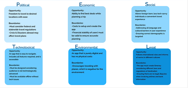
PESTEL Analysis
The PESTEL analysis was an integral part of the research process. By examining Political, Economic, Social, Technological, Environmental, and Legal factors, the analysis provided a better understanding of the opportunities and constraints shaping the app's potential success. Mapping this chart out, allowed me to further analyze critical function and design decisions I would later make for a prototype that aligned with my user's needs.
Primary Research
I conducted primary research for my prototype through surveys conducted via Google Forms and one-on-one interviews to gain more insight into my problem and how to satisfy my user's needs.
Survey Insights
67%
Found the travel planning process stressful
52%
Ranked their travel planning platform a 2/5 in terms of efficiency.
86%
Finds budgeting and finding major deals a major stress when travel-planning.
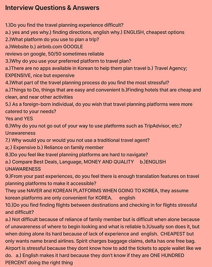
Interviews
As my parents inspired my case study, I wanted to highlight my mother as one of my interviewees for primary research. This interview gave me insight into a user directly affected by this problem and how to create empathetic designs using this feedback.
Main Interview Insights:
-Emphasis on Quality
-English Insecurity is Real
-Unawareness is the Leading Factor in the Struggle
-Expenses Debunks ALL

Secondary Research
Based on my competitive analysis and primary research insights, I conducted secondary research on my main competitors to find the weak points in the main platforms users use when travel planning.

-No extensive translation feature
-Not all features are FREE
Conflicts with foreign-born target audience & budgeting concerns
VS

-Not user-friendly for new users
-Customization is complicated
Conflicts with technology inexperience target audience & efficient planning
2
Ideation
User Personas
Using the data I gathered during the discovery phase, I was able to understand further who my users will be and how exactly I can design to their advantage. By creating user personas, I ensured empathetic design by bringing my target audience to life. This allows me to break down the specific details I need to focus on to ensure I am designing for my users' benefit and not off of personal bias.

Rohan Patel
Rohan Patel served as my main persona, representing foreign-born users who face technological and language barriers while having budgeting concerns. To further Rohan's user story, I designed a storyboard and user flow chart to visualize my target users' experience while planning a trip and what the ideal experience would be for them while using my app.
This allowed me to give more context behind my persona to ensure complete consideration of their experiences while designing my app prototype.
Storyboard

User Flow

Sketching & Wireframing
1
Mood Boards
Before beginning sketching, I created mood boards to gain inspiration for design directions and dump all my ideas before narrowing down my design.
I wanted my app prototype to incorporate blue tones and soft creams to create a sense of comfort and symbolize travel while exploring modern, clean UI designs. My mood boards reflect this design direction.

Describe your image

Describe your image

Describe your image

2
Sketching
I started the design process by sketching rough low-fidelity wireframes of what I would want my prototype screens to reflect in the final design with pen and paper. This is the exploration of my ideas and the main screens of my app prototype.
3
Medium-Fidelity Wireframes
The next step was to transfer the low-fidelity sketches into medium-fidelity wireframes using Figma. This allowed me to explore the layouts for each screen alongside the placement and incorporation of buttons, menus, and other important displays.
My main focus was creating the initial customization process and simplifying the trip home screen to include all travel planning necessities.


4
Final Color Palette
Before creating the high-fidelity screens, I finalized my color palette and categorized my primary, secondary, and neutral colors and status colors that will be integrated into different buttons and interfaces/
Usability Testing
I completed various usability testing sessions following a written script to receive feedback and make alterations to my prototype. I utilized my personal family members as my participants as they served as the inspiration for my prototype.
Main Insights:
1.) Icons are easily MISREPRESENTED
2.) People want CLARIFICATION
3.) Less is More
4.) Be empathetic to the target audience

Final Prototype
3
Extensive Translation Features

Personalized
Just for You!
The app caters to users' preferences by creating their profile and trip insights based on user input from a short survey following the sign-up process.

Trips Home Page
The "Trips" page is separated into "Drafts" and "Past" so that users can easily plan future trips and look back at old travel itineraries. Users are guided to create their next trip log using easily recognizable icons while catering to flexibility during travel planning.

Let's
Chat!

One of the app features includes a chat platform to be able to communicate and share travel plans with trip buddies easily and efficiently! The Home Screen for specific trips is also demonstrated. This was designed to streamline travel planning into one easily accessible linear process.
First, Transportation

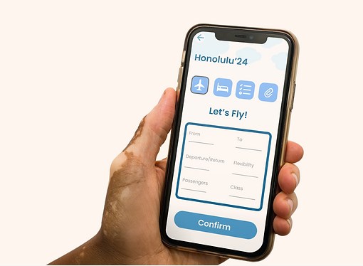
The travel-planning process starts with the user choosing their preferred travel method.
The user will be navigated toward a filter to find flexible and convenient flight options as visualized for users
choosing to fly via plane.
Best Flights
Best Prices!
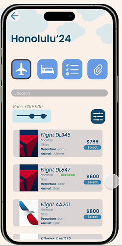
Users are given flights that match their travel preferences while finding the best deals to cater to budget stresses. The extensive filters allows for further personalization and flexibility for finding the best flights at the best prices!
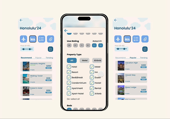
Lodging
Users are allowed to input lodging preferences with an advanced filter while also adhering to trending and afforable considerations.

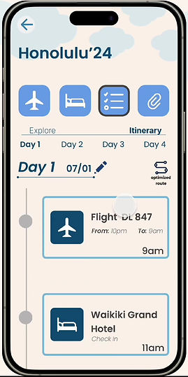
Itinerary
The itinerary section entails an explore feature, where users are able to browse different restaurants and excursions that are catered to their interests and overall popularity.
It also has embedded deals to find users the best deals and coupons.


Saving Money Every Way
UnifiTravel will automatically take the users' saved activities and commitments and create a scheduled itinerary to eliminate the stress of logistical planning.
The optimized route feature will automatically sort the itinerary to ensure users save money on gas prices, taxi services, and other travel charges.

Keep it with
UnifiTravel!
The last feature is a document binder that holds users' travel documents and confirmations to eliminate the need to hunt for essential travel documents on phones.
4
Reflection
This project was inspired by my parents and my personal experiences with travel planning. I noticed that foreign-born, technologically inexperienced travelers—like my parents—struggled to create efficient and flexible itineraries due to language barriers and limited digital tools. Their dependence on me highlighted a gap in the market, motivating me to design a travel planning platform tailored to their needs. I also prioritized budgeting features, recognizing the value of an independent planning tool over expensive travel agents.
Throughout this project, I gained a deep understanding of the UX design process, from storyboarding and wireframing to user journeys and competitive analysis. I developed a stronger proficiency in Figma, refining my ability to create intuitive, visually compelling prototypes. This experience also reinforced the importance of empathy in UX design—focusing on details that might be overlooked by the average user.
Looking ahead, I plan to expand the itinerary and profile screens, introduce a dark mode, and enhance the flight booking process to provide a more seamless experience. There’s always room to refine UnifiTravel, and I’m excited to continue improving it beyond the classroom.
